
The Seductive Simplicity of Weibull Analysis in Maintenance
Weibull analysis in maintenance is one of the most elegant tools in reliability engineering. With just a few failure data points, it can reveal life distributions, failure probabilities, and the likelihood of survival over time. The visual simplicity, a downward-sloping curve mapping failure against time, offers confidence that failures can be predicted, managed, and even eliminated.
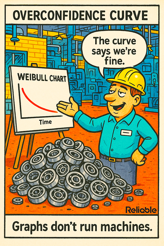
But that confidence is precisely the problem. The cartoon captures it with sharp irony: a smiling engineer stands proudly beside a Weibull chart that says everything is fine, while a mountain of failed bearings piles up at his feet. The message is clear: too often, we mistake statistical reassurance for operational reality.
The best reliability programs don’t trust the curve – they test it.
This “overconfidence curve” represents a common trap in data-driven maintenance programs: when the tools designed to improve reliability become substitutes for critical thinking. Weibull charts, regression fits, and mean life calculations can make sense of failure data, but only if the underlying data reflects actual conditions, not sanitized spreadsheets.
Reliability engineers must remember: the graph is not the ground truth. Machines don’t fail because of mathematics; they fail because of friction, contamination, imbalance, and neglect.
Why Weibull Analysis in Maintenance Fails Without Context
Weibull analysis in maintenance is built on elegant mathematics, but the math is indifferent to reality. A perfect curve can emerge from imperfect data, and that’s where reliability illusions begin. Many organizations use limited samples, inconsistent failure criteria, or outdated histories pulled from CMMS exports that have been cleaned of messy real-world variation. The model fits perfectly, but it describes the past, not the present.
Imagine a bearing population analyzed over several years of operation. The Weibull plot may suggest a 90% reliability level at 4,000 hours. But in the meantime, the plant upgraded lubricants, adjusted alignment tolerances, and changed suppliers. The system’s operating conditions evolved, but the model didn’t. The curve still “says we’re fine,” while failures quietly multiply.
This disconnect is not mathematical; it’s cultural. Many reliability teams place too much faith in data outputs and too little in the physical evidence of the plant. They interpret data as truth rather than as a hypothesis to be tested. Overconfidence grows from clean visuals and tidy parameters: beta, eta, R². The higher the fit, the deeper the complacency.
A healthy reliability culture knows that models are hypotheses—not verdicts. Each Weibull curve should trigger questions:
- What changed operationally since this data was collected?
- How does this align with actual inspection and condition monitoring results?
- Do these patterns hold across different shifts, suppliers, and environments?
If the answers aren’t clear, the model is decorative, not diagnostic.
Integrating Weibull Analysis in Maintenance With Real-World Feedback
The most effective programs treat Weibull analysis in maintenance as one component of a continuous feedback loop. The model defines expectations; the plant data tests them. When those two streams diverge, that’s where real reliability insight begins.
To make Weibull analysis genuinely helpful, connect it to condition-based and predictive maintenance systems. For example:
- Correlate failure probability with vibration trend data. Rising amplitudes at specific frequencies should shift expected failure distributions.
- Overlay Weibull projections with oil analysis results. Contaminant levels often predict premature failure long before the theoretical mean life expires.
- Update the shape (β) and scale (η) parameters regularly. Static parameters in a dynamic plant create misleading certainty.
- Validate with field feedback. Work order notes, inspection photos, and technician observations are qualitative data that contextualize quantitative results.
In essence, Weibull analysis should live inside a closed-loop system: prediction → observation → correction → recalibration. The goal isn’t to prove the model correct but to make it more accurate through confrontation with reality.
Reliability leaders who practice this discipline find that Weibull analysis becomes more than a retrospective graph; it becomes a living diagnostic instrument. It tells a story about the equipment’s reliability maturity: where assumptions hold, where conditions drift, and where proactive intervention could entirely rewrite the next curve.
Building a Reliability Culture Beyond the Graph
The more profound message behind the cartoon, and behind every failed overconfidence curve, is cultural, not analytical. The tools are sound. The logic is proven. What fails is the human tendency to mistake visualization for verification.
Building a mature reliability culture requires shifting emphasis from analysis to synthesis. Weibull charts, Pareto diagrams, and MTBF graphs are valuable only when they drive behavioral change. This requires leadership commitment, technician involvement, and a feedback-rich environment.
Here’s what that looks like in practice:
- Empower technicians to question the data. Encourage them to flag contradictions between what the chart predicts and what the machines show.
- Cross-train analysts and field personnel. A data scientist who spends time on the shop floor interprets charts differently from one who never leaves the screen.
- Use Weibull analysis as a conversation starter, not a final report. Reliability meetings should end with “What do we need to verify?” rather than “Good, the numbers look fine.”
- Track prediction accuracy. Over time, compare model forecasts to actual event logs. This builds accountability and improves calibration.
When this mindset takes hold, Weibull analysis becomes an amplifier for operational awareness—not a shield against it. Teams learn to value the insights hidden in failure variability, rather than smoothing them away for statistical cleanliness.
From Overconfidence to Operational Wisdom
The humor in the cartoon isn’t just about bad analytics; it’s about human nature. People crave certainty, and graphs offer it in tidy visual form. But reliability is never neat. Machines operate in messy environments where temperature, contamination, misalignment, and human error constantly rewrite the equations.
The most successful maintenance programs combine analytical precision with experiential judgment. They use Weibull analysis to guide, not to govern. They recognize that the curve is a snapshot of the past, while the plant floor is a movie in motion.
When those two perspectives merge —data and reality, theory and touch —the results are extraordinary. Maintenance becomes predictive and adaptive. Failures decrease, uptime improves, and confidence is earned rather than assumed.
Because in the end, as the cartoon’s tagline reminds us:
“Graphs don’t run machines.”
Reliability does.