KPI Dashboards of Shame: Transparency That Hurts – and Heals
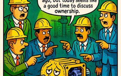
In every underperforming facility, there’s a moment when the numbers turn red, the leadership turns silent, and the dashboard turns into a wall decoration. This cartoon captures that moment perfectly: a hardhat-wearing worker strolling past a KPI board full of underperforming metrics—safety, quality, efficiency—all bleeding red. His response? “If I can’t see it, it can’t hurt me.”
It’s a funny moment—but also a dangerous mindset. KPI dashboards for accountability are only painful when the culture resists transparency. When embraced, they are the gateway to operational excellence. When avoided, they become tombstones for missed goals.
It’s time to shift the narrative: KPI dashboards aren’t walls of shame—they’re maps to progress.
KPI Dashboards for Accountability: Stop Hiding and Start Improving
The concept of KPI dashboards for accountability is straightforward: put the right metrics in front of the right people, in real time, with no sugarcoating. But many plants fail to use this data as a force for action. Instead, they hide it, delay reporting, or interpret it defensively.
This behavior stems from fear—fear of blame, job loss, or simply looking bad. But shielding teams from bad news doesn’t protect performance—it enables stagnation. True accountability begins when everyone can see the same reality and work toward a better one.
Key functions of a performance-oriented KPI dashboard:
- Expose performance gaps early
- Tie metrics to roles and actions
- Create a feedback loop for continuous improvement
- Drive alignment across departments
A well-designed dashboard won’t just display data—it will shape behavior.
Don’t Fear Red: Use It as a Call to Action
The cartoon frames red KPIs as shameful—but red should actually be the most valuable data on the board. It tells you where the fire is, what to fix, and how fast you need to move. KPI dashboards for accountability are powerful because they don’t allow red to stay hidden.
The key is context. Red without explanation feels like blame. Red with root-cause analysis feels like opportunity. When leaders use dashboards to diagnose and coach rather than scold and punish, teams become willing to engage. They learn to treat metrics as feedback, not judgment.
Practical tips to reframe red metrics:
- Pair each red KPI with a known corrective action.
- Show trend lines over time to highlight progress, not just status.
- Celebrate the closing of performance gaps—don’t just mourn their existence.
Once people realize red is not permanent, but addressable, dashboards become empowering.
How to Design KPI Dashboards for Accountability That Actually Work
A dashboard is only as good as its design. Flashy graphics and colors don’t drive performance—relevance, visibility, and ownership do.
1. Prioritize actionable metrics
Don’t overload with 30 KPIs. Focus on those that tie directly to business outcomes. Avoid vanity metrics that make things look good but mean nothing (e.g., “website visits” for a maintenance team).
2. Ensure real-time or near-real-time updates
Stale data is almost worse than no data. If your dashboard updates weekly or monthly, the feedback loop is too slow. Daily visibility sharpens focus and urgency.
3. Display dashboards publicly
Transparency dies in silos. Put performance in shared spaces—shop floor monitors, team huddle boards, breakrooms. When data is seen, it becomes part of the culture.
4. Make metrics role-specific
A plant manager needs different KPIs than a technician. Segment dashboards by audience to ensure each person knows how their actions affect the outcome.
5. Link KPIs to improvement plans
Every red bar should trigger a corrective path. Dashboards without next steps lead to cynicism and disengagement. Dashboards with plans create hope.
This is where leadership matters most. The goal isn’t to catch people failing—it’s to create an environment where it’s easy to succeed.
From Shame to Strategy: Transforming Your Plant With KPI Visibility
This cartoon’s punchline—“If I can’t see it, it can’t hurt me”—perfectly illustrates a deeply embedded problem in many organizations: the belief that ignoring bad news will somehow protect morale or reputation.
But let’s be blunt. What you don’t measure gets worse. What you don’t discuss becomes taboo. And what you hide will eventually cost you—either in downtime, safety incidents, customer dissatisfaction, or all of the above.
KPI dashboards for accountability give you the power to:
- Uncover systemic issues before they explode
- Align teams around shared outcomes
- Turn metrics into momentum
- Build a culture of honest improvement
The only thing worse than seeing a red KPI is not seeing it at all.
Final Thoughts: Own the Numbers Before They Own You
If your plant’s performance is subpar, hiding the data won’t protect you—it will delay your recovery. Instead of ignoring the dashboard, embrace it. Instead of fearing the red, learn from it. Use KPI dashboards for accountability as a springboard to performance—not a scoreboard of shame.
When teams see data as a reflection of collective effort, not individual blame, real change happens. Transparency hurts—only if you’re afraid to fix what’s broken.
So take off the metaphorical sunglasses. Look at the board. Then do something about it.