
As maintenance and reliability professionals, we are driven by data. We track Key Performance Indicators (KPIs) to measure our performance, justify our budget allocations, and inform our decision-making. Yet, the way most organizations visualize this critical data—the simple bar chart—is fundamentally flawed.
Month after month, we present bar charts of KPIs like Schedule Compliance, PM Compliance, and Availability. We color them green for good and red for bad, and we brace ourselves for the inevitable questions that follow. “What happened in March? Availability was down!” or “Great job in October, Schedule Compliance was up! What did you do?”
Reacting to every KPI swing is like steering for every bump—exhausting, misleading, and pointless.
Too often, the honest answer is “we don’t know.” The dip in March might have been statistical noise, and the spike in October could have been a fluke. Reacting to these individual data points is like adjusting the steering wheel for every tiny bump in the road; it’s exhausting, ineffective, and distracts from the real destination. This is the “red-green rollercoaster,” and it’s time to get off.
There is a better way. Statistical Process Control (SPC) offers a data-driven framework for understanding and improving our processes. By replacing the traditional bar chart with a powerful tool called a control chart, we can finally distinguish between normal process variation and a true signal of change, allowing us to make smarter decisions and drive sustainable improvements.
The Problem with Bar Charts vs. The Power of Control Charts
A bar chart is a snapshot of a moment in time. It shows performance for a single period, often compared to a static goal line. This approach is problematic because it fails to recognize a fundamental truth: all processes have variation.
Control charts, on the other hand, graphically display process data over time and embrace this reality. They feature three critical, statistically-derived lines:
- Center Line (CL): This represents the process average or mean. It’s what your process is actually delivering over time.
- Upper Control Limit (UCL) and Lower Control Limit (LCL): These two lines are plotted above and below the Center Line. They are the “voice of the process,” representing the natural and inherent variation that your process exhibits. They are typically set at +3 and -3 standard deviations from the average.
The genius of the control chart is that its limits are calculated from your own data. They show what your process is capable of, not what someone wishes it would be. This allows us to make the crucial distinction between two types of variation:
- Common Cause Variation: This is the natural, built-in, or inherent “noise” of a process. It is a result of the system itself and will persist as long as the system remains unchanged. On a control chart, this looks like a random pattern of data points between the Upper and Lower Control Limits. If you are unhappy with the results from common cause variation (e.g., your average performance is too low or the variation is too wide), the only way to improve is to change the underlying system.
- Special Cause Variation: This is an unusual, unpredictable event that is not part of the normal process. It is a signal that something has changed. On a control chart, this is identified by non-random patterns. Responding to a special cause requires investigating what happened at that specific point in time to either correct a problem or institutionalize a positive change.
The corrective actions for each type of variation are fundamentally different, which makes this distinction critical. Trying to “fix” common cause variation as if it were a special cause leads to frustration and wasted resources. The control chart is the only tool that allows us to distinguish between the two.
The Right Tool for the Job: The X-MR Chart
The choice of control chart depends on the type of data being measured. Many core maintenance KPIs—such as Schedule Compliance, PM Compliance, and Availability—are reported as a single continuous value (often a percentage) for a given period (like a month). For this type of data, the Individuals and Moving Range (X-MR) chart is the most suitable and robust tool.
The X-MR chart actually consists of two charts:
- The Individuals (X) Chart: This chart plots the individual KPI values over time (e.g., the monthly percentage for Schedule Compliance). It tracks the process average and helps detect shifts in the process.
- The Moving Range (MR) Chart: This chart plots the range, or difference, between consecutive data points. It tracks the process variation and helps detect changes in consistency.
This chart is recommended for KPIs such as Overall Equipment Effectiveness (OEE), Schedule Compliance, and PM & PdM Work Order Compliance, as they are single, continuous values reported periodically.
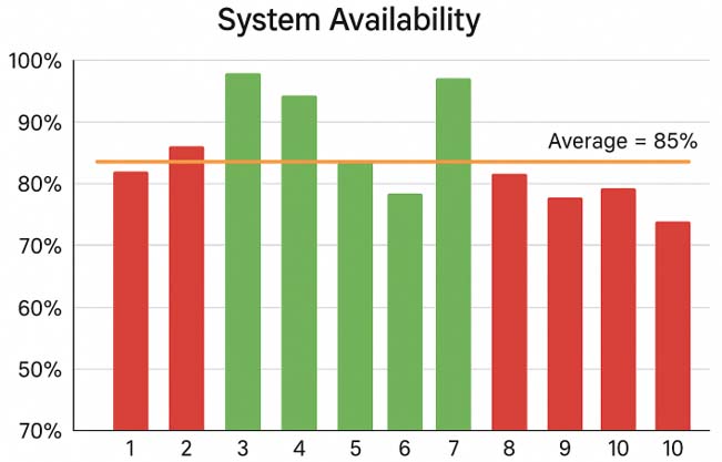
A typical bar chart showing volatile monthly schedule compliance data, with some bars colored red and some green against a target line.
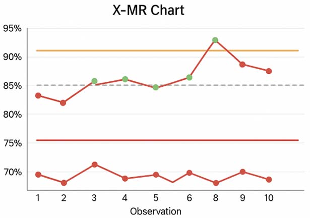
An X-MR chart showing the same data. Note that there is only one week out of control.
Reading the Signals: An Introduction to Nelson’s Rules
A process is considered “in control” or stable if the data points are randomly distributed between the control limits. But how do we spot a non-random pattern that signals a “special cause”? We use a set of rules to detect them. While there are several rule sets, the “Nelson Rules” are a well-regarded standard. Here are four of the most common and powerful rules:
- Rule 1: One point is outside the control limits (beyond +/- 3σ). This is the clearest and most obvious signal of a change in the process. It’s a fire alarm that requires immediate investigation.
- Rule 2: Nine (or more) consecutive points are on the same side of the Center Line. This indicates that the process average has shifted. A run of points above the average could be a signal that an improvement initiative is working. A run below could signal that something has degraded.
- Rule 3: Six (or more) consecutive points are all steadily increasing or decreasing. This is a trend. It suggests that a gradual change is occurring in the process, such as slow equipment degradation or, conversely, a slow and positive adoption of a new technique.
- Rule 5: Two out of three consecutive points are on the same side and more than two standard deviations from the Center Line. This is a strong early warning of a potential shift in the process.
When one of these rules is triggered, it’s a statistical signal that something has likely changed. It’s time to investigate the special cause.
Case Study: Pro-Reliability Inc. Ditches the Bar Chart
Let’s see how this works in practice with a fictitious company, Pro-Reliability Inc.
Phase 1: The Red-Green Rollercoaster
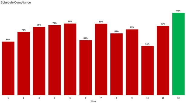
For years, the Maintenance Manager at Pro-Reliability tracked weekly “Schedule Compliance – Hours” with a bar chart against a target of 90%. The team was constantly chasing its tail. In Week 2, management inquired about the reason for the drop in compliance to 55%. The team spent days investigating, finding no single cause. In Week 5, they were praised for hitting 80%, but they hadn’t done anything differently. The process felt random, and morale was low.
Phase 2: Achieving Stability with an X-MR Chart
A new Reliability Engineer joined the team and plotted the same 12 weeks of data on an X-MR chart.
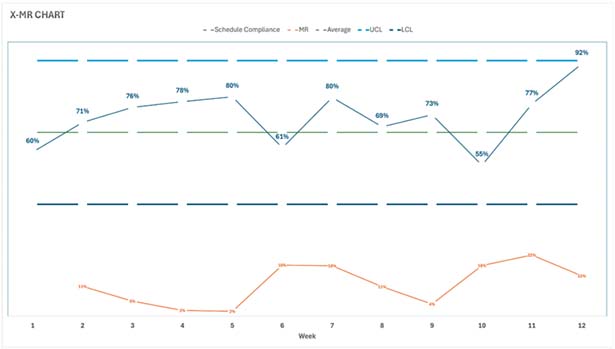
The chart was a revelation. The Reliability Engineer explained: “Our process is stable, or ‘in control.’ The variation we’re seeing, from a low of 55% to a high of 80%, is just the natural noise in our current system. Responding to these dips and spikes is a waste of time. The data shows that our system is perfectly designed to produce an average schedule compliance of 67%, and it will continue to do so until we change the system itself.”
The focus shifted from blaming individuals for random variation to analyzing the process. The team identified systemic issues: work was not being adequately planned before scheduling, the backlog was poorly managed, and the work prioritization was inconsistent.
Phase 3: Driving Real Improvement
The team implemented a formal planning and scheduling process. They dedicated a planner to develop proper job plans and started holding weekly scheduling meetings with Operations. They knew this was a significant “special cause” change, and they monitored the control chart to see if it would have a real statistical impact.
Phase 4: A Signal of Success
Over the next nine weeks, the new data was plotted on the existing control chart.
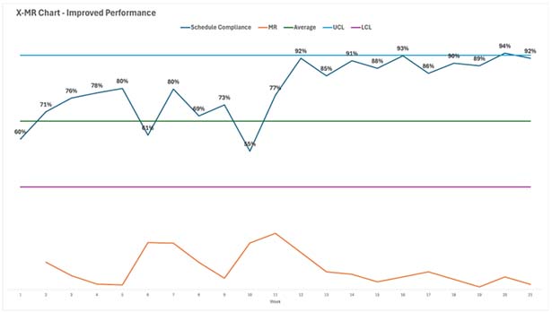
In the ninth week after the change, the team had their proof. The control chart showed nine consecutive points above the old average of 67%. This triggered Nelson’s second rule, providing a statistical signal that the process average had fundamentally shifted upward. The improvement was real, not just a random spike.
Phase 5: Locking in the Gains
Now that the process had been fundamentally improved, the team could recalculate the control limits based on the new data. The new Center Line was 90%, with much tighter control limits. This became their new standard of performance.
The X-MR chart had not only helped them identify the need for systemic change but also validated that their efforts were successful. They now used it to monitor the new, more capable process and to watch for any new special causes—both good and bad—that might emerge.
Make the Switch
The tools of our trade are evolving, and so must our methods for measuring performance. The monthly bar chart is an artifact of a bygone era of data analysis. It promotes reactive behavior and obscures the true nature of our processes.
By adopting SPC control charts, you can:
- Stop reacting to noise: Distinguish between common and special cause variation.
- Focus on the system: Understand when to improve the overall process instead of reacting to single events.
- Measure the impact of change: Statistically prove whether your improvement initiatives are actually working.
- Foster a culture of continuous improvement: Provide your teams with a stable, predictable view of their performance.
Making the switch requires a commitment to learning and a new way of thinking, but the payoff is enormous. It’s time to get off the red-green rollercoaster, leave the bar chart behind, and start managing your maintenance and reliability processes with the statistical clarity they deserve.
KPI Definitions and Best Practices
KPI: Schedule Compliance – Hours
- Definition: A measure of adherence to the maintenance schedule, expressed as a percent of total time available to schedule.
- Formula: (Scheduled Work Performed (hours) / Total Time Available to Schedule (hours)) × 100
- Best-in-Class Target: > 90%
KPI: PM & PdM Compliance
- Definition: A review of completed preventive maintenance (PM) and predictive maintenance (PdM) work orders, wherein the evaluation is against preset criteria for executing and completing the work.
- Formula: (PM & PdM work orders completed by due date / PM & PdM work orders due)
- Best-in-Class Target: Above 90%. It’s advised to investigate non-compliance reasons, implement improvements, and monitor results.
KPI: Availability (Operational)
- Definition: The percentage of time that an asset is actually operating (uptime) compared to when it is scheduled to operate. This is also called operational availability.
- Formula: {Uptime (hrs.) / [Total Available Time (hrs.) – Idle Time (hrs.)]} x 100
- Best-in-Class Target: Best-in-class values for this metric are highly variable by industry and facility type. It is recommended that organizations use this metric to manage and improve their processes based on business needs.