
There are dozens of interpretations of the PF curve. I wanted to show off my interpretation. They share a shape but assign different explanations for each of the regions. I believe this curve originated with John Moubray, who was a leading RCM proponent.
One area of confusion was the endpoint. Moubray used the functional failure as the endpoint rather than the breakdown. This thinking makes sense since, in RCM, when an asset cannot perform its function (under standard operating conditions) for which it was designed (like an airplane engine), a crisis has occurred (even if some thrust remains).
Functional failure—not catastrophic breakdown—is where the real maintenance battle is won or lost.
If you can only get 50 hp out of a 200 hp motor, there has been a functional failure. Further deterioration will lead to a breakdown, during which associated damage may occur (failure of close or related parts- making a simple bearing replacement turn into an impeller, housing, and seal failure). Typically, at the functional failure state, the repair is more confined than it would be if the asset were allowed to reach full catastrophic breakdown.
Potential Failure and Functional Failure
There are two main points of the P-F curve that need to be identified.
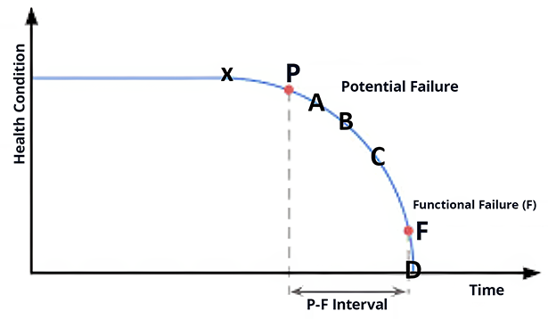
Potential failure indicates the point at which we notice that equipment is starting to deteriorate and fail. (P)
Functional failure is the point at which the asset no longer operates to specified limits in a defined operating context. (F)
The elapsed time (or another measure) between two points represents what’s called the P-F interval—the time between when the failure is initially noticed and when the equipment has failed its function.
The P/F curve also indicates that something occurred, but that event may be too small to detect (X). After a while, the result of whatever happened is detectable using sophisticated condition monitoring scanners or instruments. At this first point of detection in the deterioration curve, we now have a potential failure.
As the asset continues to deteriorate (points A, B, C), the potential failure is detectable using different modalities. Finally, the deterioration is detectable using human senses.
X: Something has happened to start the deterioration cascade. Too small to detect. Sometimes called the Critical Event (CE)
P: First point of detectability with technology such as vibration analysis or ultrasound
A: Might be detectable using Infrared or oil analysis
B: Human- Might be detectable by a highly skilled worker with long experience
C: Human- Anyone in the room would detect the problem (heat, sound, etc.)
F: The Asset can no longer fulfill its function
D: The Equipment has broken down. It no longer functions at all.
Where Do You Find the Curves?
The problem that is rarely addressed is where to obtain an accurate P-F curve. I’ve never seen it in any Operations and Maintenance (O&M) manual. I’ve never seen it in the engineering materials that accompany a new machine. A few vendors will provide an estimated life (such as the L10 life of bearings).
For me, the P-F curve is a beneficial model of failure. As a model, it can be used (in a limited way) to answer questions and solve problems. Don’t forget it is a model. And don’t forget that a single asset might be running 100s of P-F curves (for each failure mode) simultaneously.
Extending PF Curve Thinking to MTTR
The MTTR (Mean Time to Repair) can begin from the failure (F) and extend to the start of the next PF curve. Typically, it only includes the time from the beginning of the repair.
If you add the prep time, you will have an accurate estimate of the entire maintenance process to avoid failure and return to operation. MTTR can also stand for Mean Time To Restore. The advantage of that measure is that this MTTR doesn’t stop until the asset is back in service.
How PF Curves Inform Optimal PM Intervals
The PM interval can be determined directly from an accurately drawn PF curve. The interval should be about ½ the length of the PF interval to ensure you catch the deterioration before it results in a functional failure. To be more rigorous, we must also consider the mobilization time for the repair.
If all the necessary job elements are available (parts, skilled labor, asset access, etc.), then the average mobilization time might be a day or two, or at worst, a week if a weekly schedule is used.
If parts must be procured, a shutdown is scheduled, or tools are rented, then the PF interval might not be long enough. In that case, either improve the technology to detect the problem sooner, enhance it, or continuously monitor the asset. The last option is to let the system run to failure (assuming no deaths or environmental catastrophes) or redesign (if there are dire consequences).
PM frequency is almost always a guesstimate because there are several PF curves for each piece of equipment.
PF curves are related to failure modes in that each failure mode might have its own PF curve (some failure modes might share a PF curve, too). What happens when there are several PF curves for a critical asset?
Each failure mode has a probability of failure (PF) interval. The length of the PF intervals can vary significantly. In a rigorous or ideal world, the reliability engineer would plot all the PF intervals and build the PF task lists and activities from the various plots. That means there might be a PF interval of 36 days for failure mode A, another at 27 days for failure mode B, and another at 65 days for failure mode C.
The PM might embrace a 30-day frequency for A and B and a 60-day frequency for A, B, and C.
The effectiveness of the PM/PdM system is in simply keeping all the PF curves on the flat part or detecting when any curve starts to dip (and bringing it back up to the flat part).